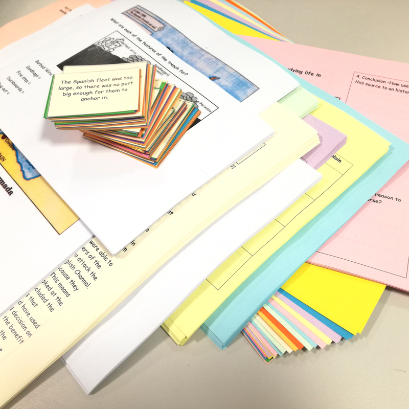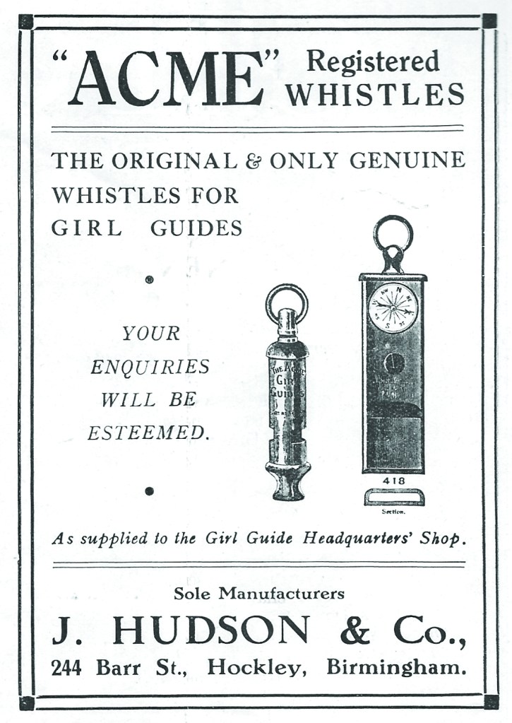
Repro; copying and reproduction of documents and printed material.
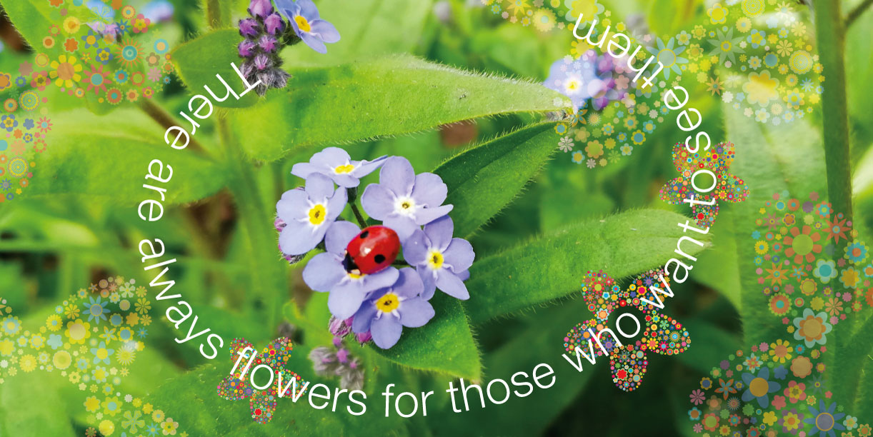
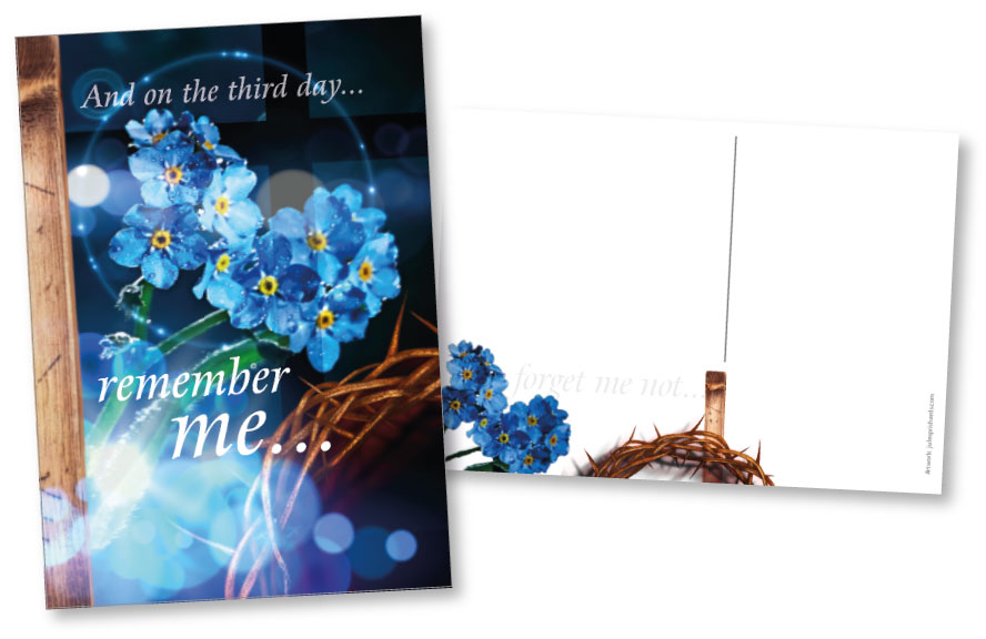
Graphics; creating imagery and visual material to communicate significance.
A friend once said, “you just do colouring-in for a living”. Yes, perhaps; but, as I have studied… the graphic Signifier will relay an idea that is Signified; in essence, this is what a Sign is.
As David Carson said, “Just because something is legible doesn’t mean it communicates”.
How can we make the most of a simple opportunity to say something?
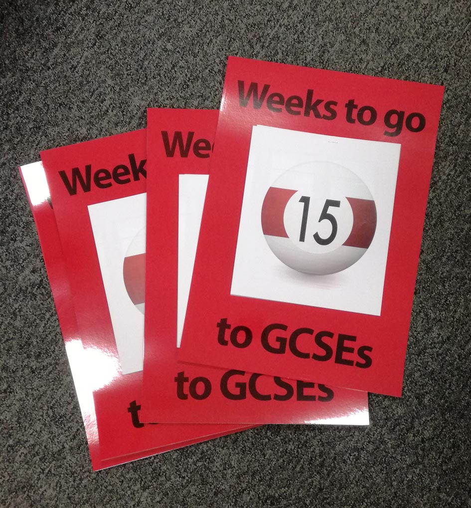
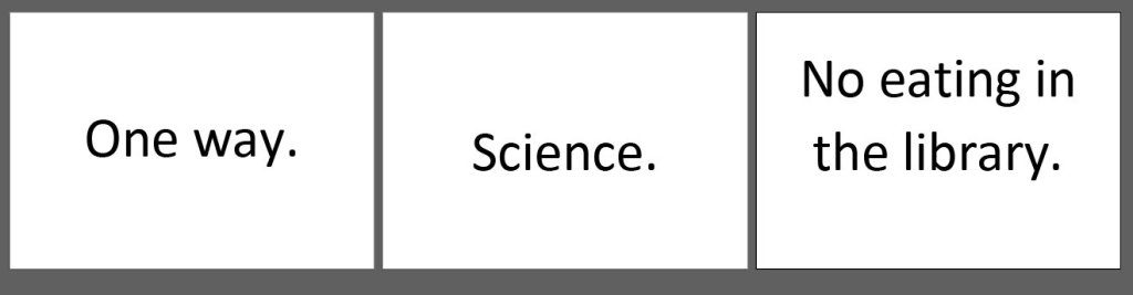
“Can you just do a simple ‘One Way’ sign for me?” Or, a sign to ‘Science’… or a ‘No eating in the library’ notice?
Yes, of course, but what more can we do with that opportunity for signification?


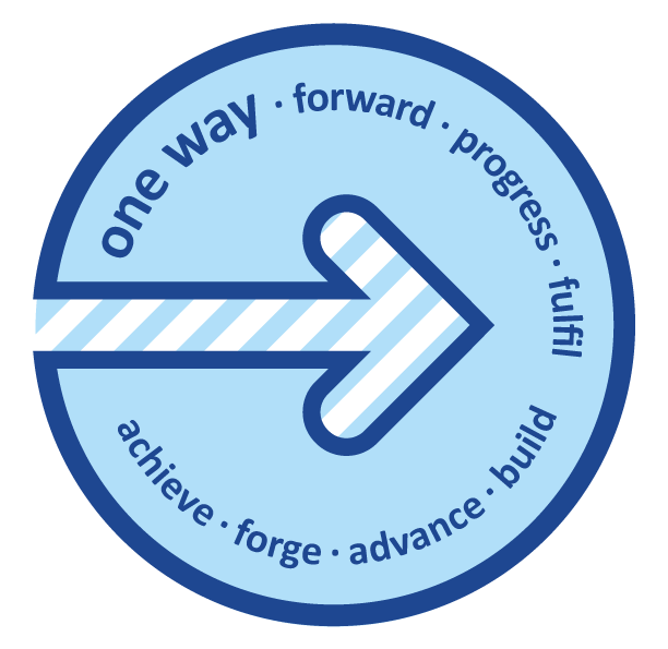
We can add value to the everyday. Often print might simply have a utilitarian function, but that does not mean to say it can’t have added value, look smart, and reflect or reinforce the tone and climate of its environment.
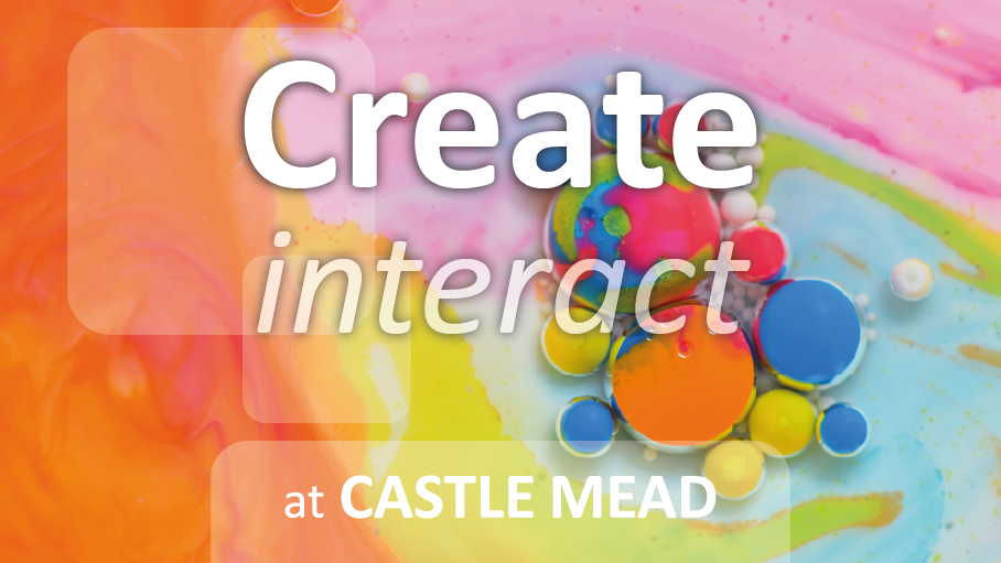
Can you just print me some signs saying ‘Textiles’ and ‘Graphics’?


Yes, of course, but what more can we do with that sign?
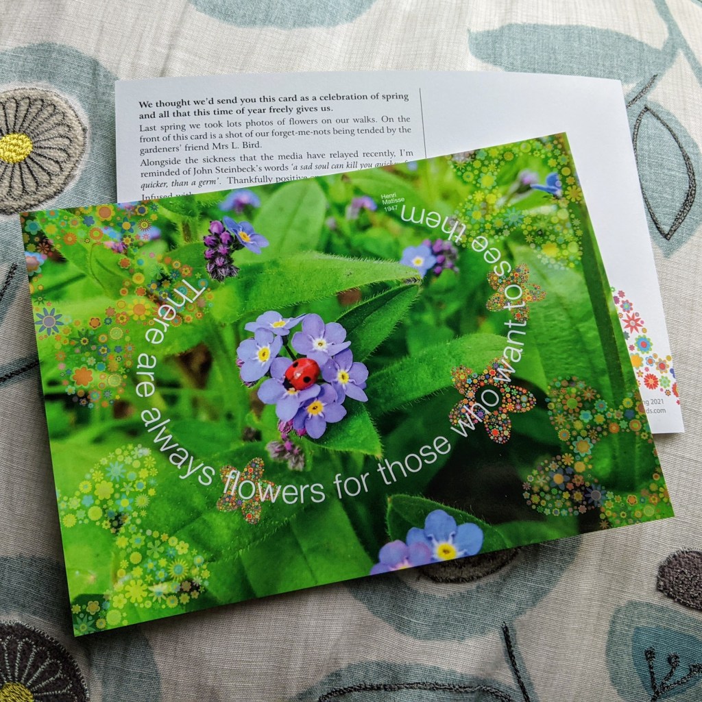
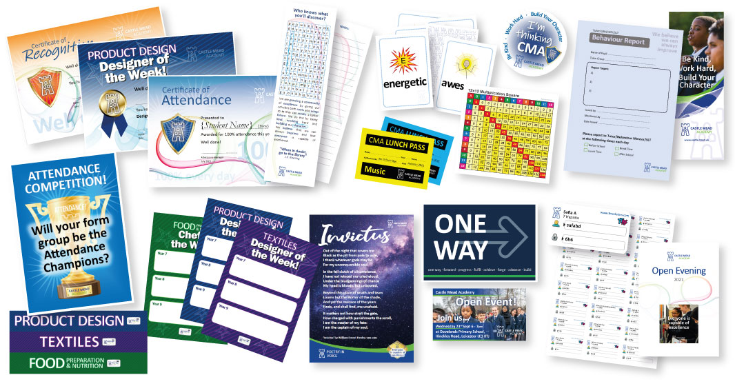
The front cover of a worksheet, the postcard home, the certificate of achievement, or even the punctuality report; all of these can have added value beyond the initial function. Integral to their design, they can reflect and reinforce the values, visions and ambitions of the organisation.


This can be done in part by keeping the style and form of the organisation’s design elements consistent, and adding and repeating form and sub-content that promotes values and reinforces messages.
There’s more to it than that, but again as David Carson said, “It’s not about knowing all the gimmicks and tricks…”… You need to feel it.

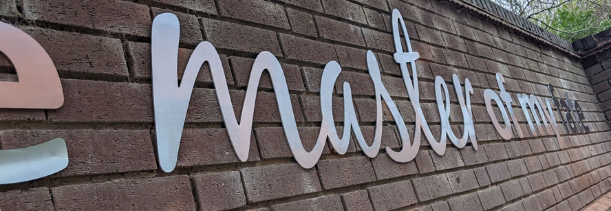
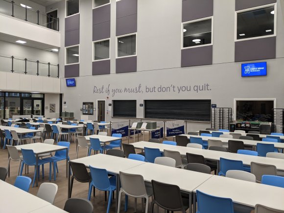
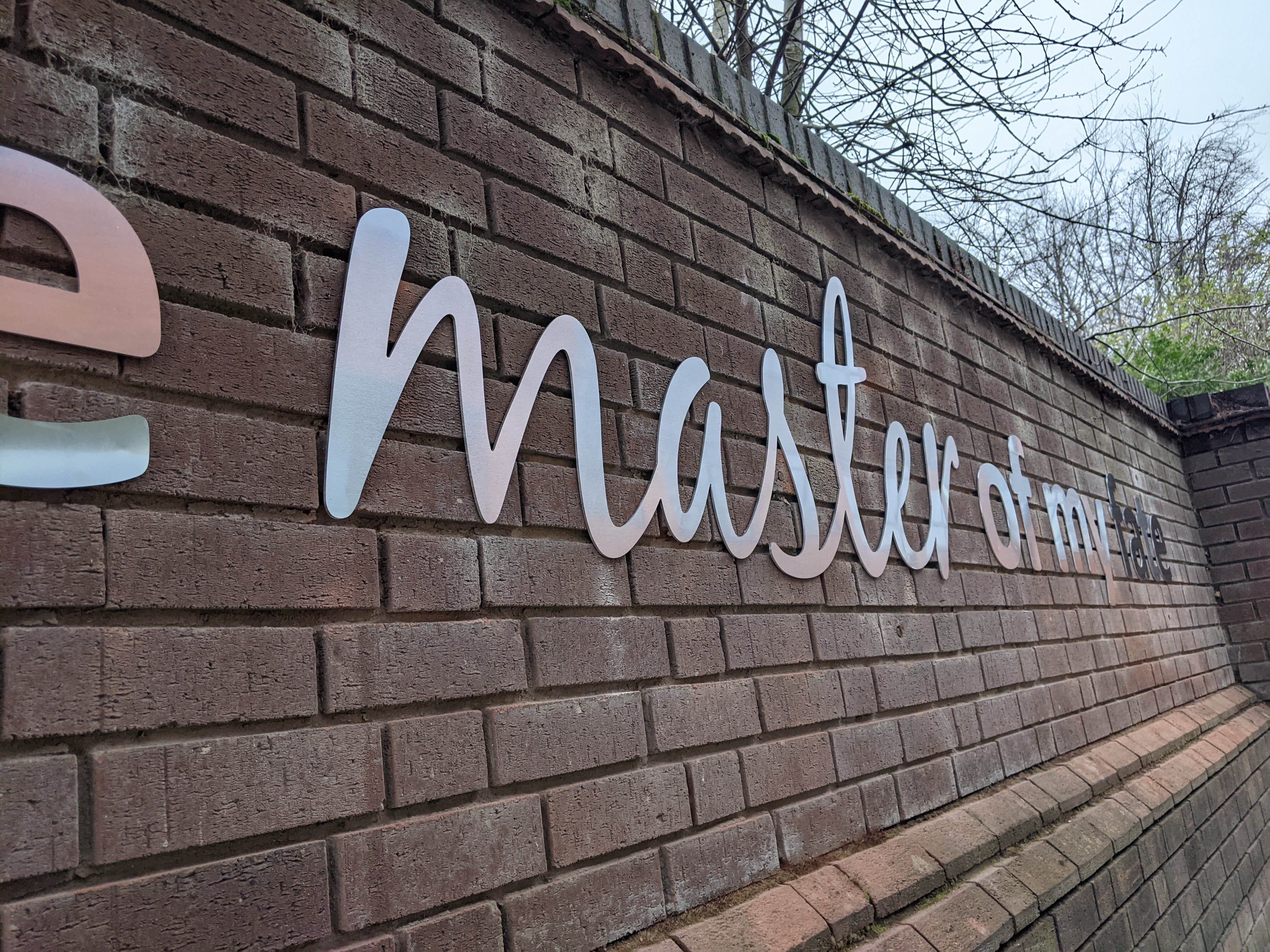
As well as small repro works, I’ve recently overseen the creation of some large text signage for interior and exterior walls.
Our aim was to reinforce ambitions using simple quotes from the school’s poetry canon. Yes, we could have gone bold and loud with colours and imagery. However, in this case it’s just the words themselves using simple consistent typography.
Inside the building the light warm grey colour is subtle and almost a subliminal presence (Expertly installed by Big City Graphics, Leicester).

Outside we’ve gone for a strong yet simple aluminium. (Expertly installed by Focus Signs, Leicester)


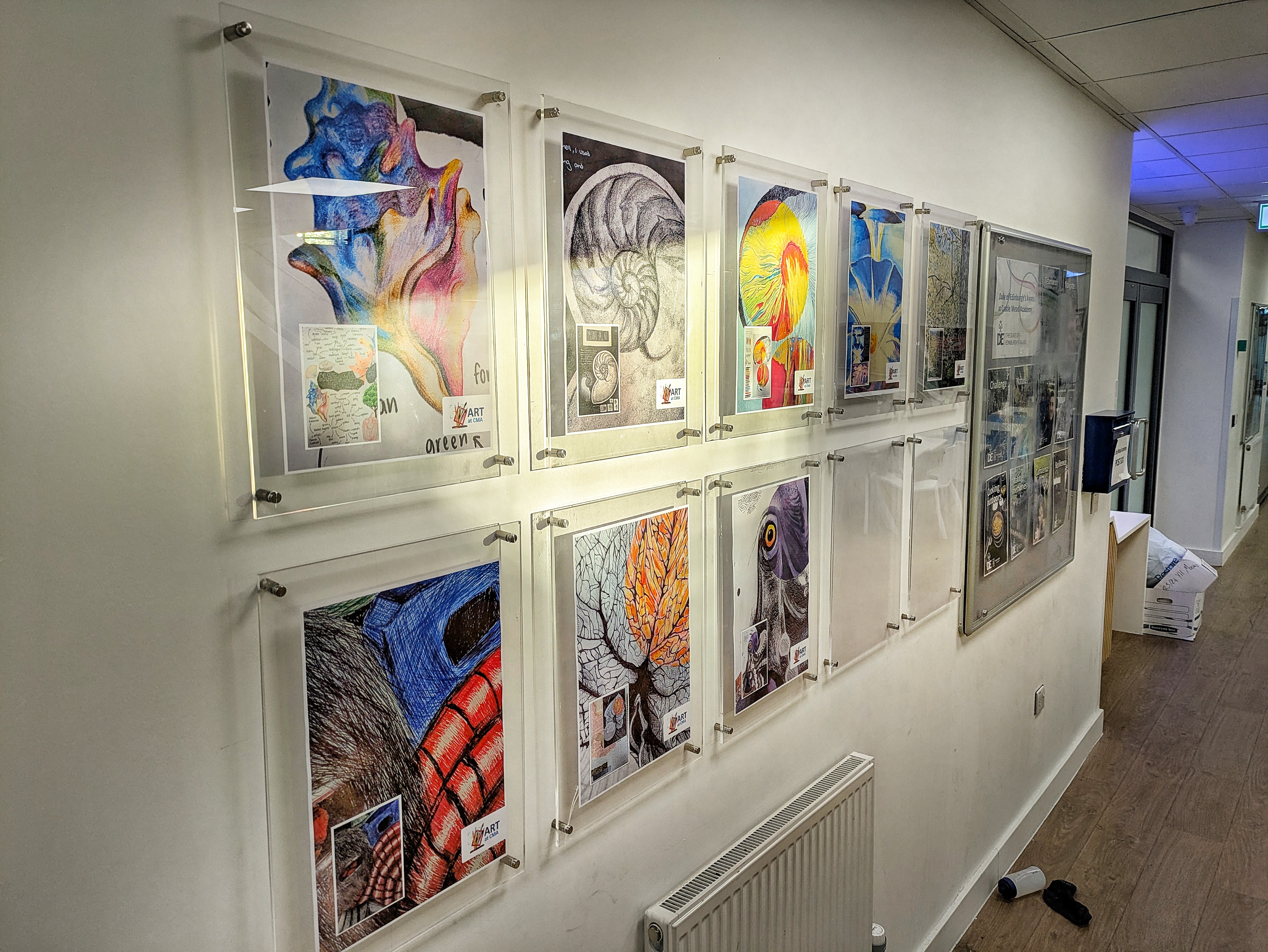
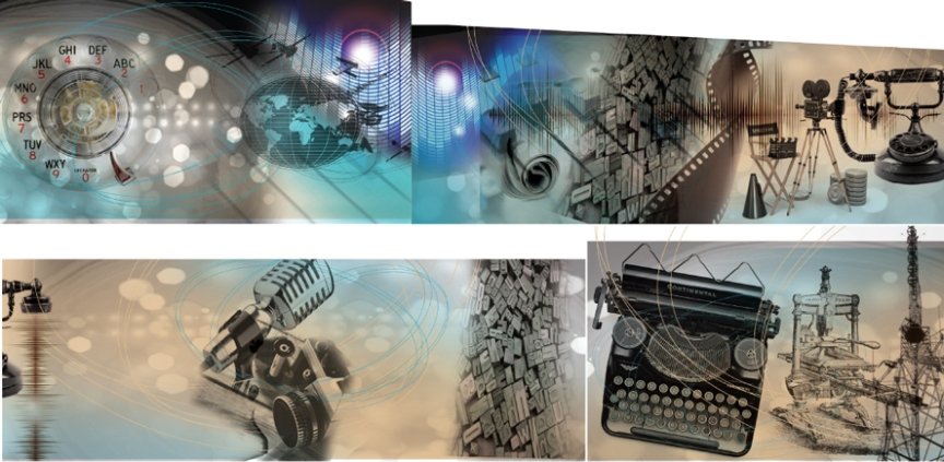
In the past, I’ve designed large wall-collage compositions, creating artwork for a local sign maker who installs murals to cover complete walls/rooms in primary schools.


So, from a one off ‘sign for the loo’, to an energetic topical graphic statement…

Reprographics; reproduction of printed material and imagery that communicates meaning.
It’s part of what I do…